In our day to day, we make use of heuristics (mental shortcuts that allow us to make decisions, pass judgment or solve problems quickly)1 to navigate the environment around us reducing our cognitive load, so as to be able to dedicate it to other actions that require more attention and reasoning.
Heuristics also apply when we use technology, as we interact with different devices and platforms. In our article on Persuasive Technology and Digital Engagement, we talked about certain dynamics of use and connectivity that do not happen just by chance, and about design and interaction mechanics used by technology companies to compete for our attention and have an impact on our actions and behaviors by exploiting certain mental processes.
Apart from the dynamics already mentioned in that post, there are also design patterns that implement persuasion and manipulation tactics to take advantage of our mental shortcuts and get us to perform certain actions without our prior knowledge or consent. These design patterns are known as Dark Patterns. In this post, we will discuss the different types of patterns discovered to date, and how they impact our interactions in digital spaces. We will also share some ongoing collective efforts to identify their use on different platforms, to make other users aware of their existence, and to demand that apps and interfaces are designed in a more ethical and responsible way.

Concept and importance
The concept of dark patterns was created in 2010 by UX designer Harry Brignull and it refers to “tricks used in websites and apps that make you do things that you didn’t mean to, like buying or signing up for something” 2 Although these tricks or mechanics are many times harmless, they can also be used for purposes such as getting you to reveal personal data, staying on a website longer than you would want to, providing financial information or unwittingly spending money, among others.
Regarding the application of heuristics to UI design, a well-known example within the UX field are Jakob Nielsen’s 10 Usability Heuristics for User Interface Design, a set of broad rules of thumb to achieve a more agile interaction with platforms. However, dark patterns may take advantage of this system of mental shortcuts and human perceptions, making users prone to manipulation and persuasion. As Brignull points out, when we use websites and apps we don’t actually read every word on the page; instead, we quickly read parts of it, and then we assume what the rest says, leading to plenty of opportunities for dark pattern dynamics to be implemented.
The use of dark patterns, manipulating (and many times collecting) our data without our consent, represents a violation of consumers rights that we must not ignore. In fact, in the United States, a bill known as the DETOUR Act was introduced in 2019 in the Senate “to prohibit the usage of exploitative and deceptive practices by large online operators and to promote consumer welfare.” Furthermore, the bill expressly states that it shall be unlawful “to design, modify, or manipulate a user interface with the purpose or substantial effect of obscuring, subverting, or impairing user autonomy, decision-making, or choice to obtain consent or user data.”
Examples like this denote the importance of raising awareness on the subject and demanding more ethical and responsible design practices, acknowledging that dark patterns are not implemented by chance: they are designed based on studies on how certain cognitive and perception factors impact the actions of users, purposely jeopardizing our ability to inhabit digital spaces and make decisions in an autonomous and consented way.
Types of Dark Patterns
There are different types of dark patterns3. Among the most popular are the following:
Trick questions
The action of formulating a question in such a way that causes users to respond something contrary to their intention. The question seems to ask one thing when you look at it quickly, but when read carefully it actually asks something different.
This type of dark pattern is very common when we subscribe to a service. In the image below, you can see that the penultimate checkbox says “Please do not send me details of products and offers from Currys.co.uk”:
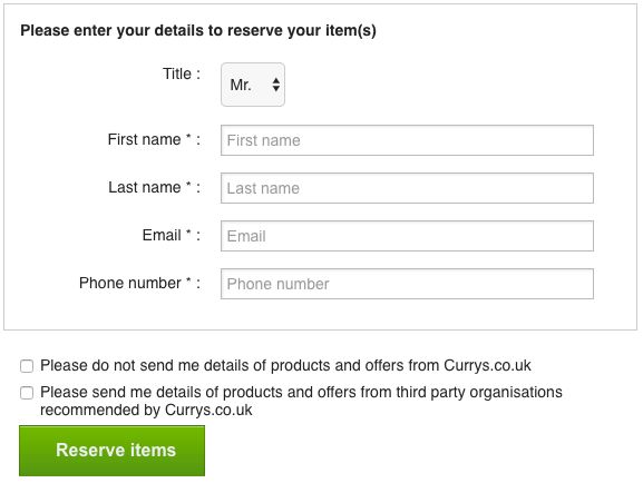
Due to heuristics, we tend not to tick these types of checkboxes, because we are used to them saying that we do want to receive news about offers or promotions (in fact, that is what the second one says). In this case, the question is formulated in such a way that it says the exact opposite just by adding two words and, if we do not tick it, we will end up receiving unwanted emails or notifications about the service.
Sneak into Basket
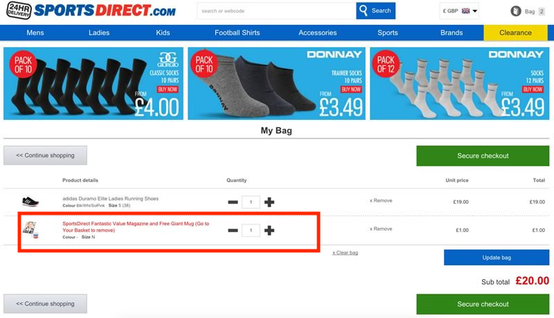
This type of dark pattern usually appears on shopping sites, where the site automatically sneaks an extra item into our shopping basket. This pattern is currently illegal in the UK and the EU, thanks to the Consumer Rights Directive. Below is an example mentioned on darkpatterns.org, where we can see how an online store adds an extra item (the one marked in red), when the user was trying to buy only a pair of shoes:
Roach Motel
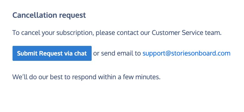
This dark pattern refers to a situation where we can easily register and/or subscribe to a list or service, but where leaving is a tedious and complicated process, purposely put in place by those who designed the platform. This results in a “Kafkaesque” and absurd journey to try to opt-out from the service.
Imagine, for example, that you want to unsubscribe from a service, and to do this you have to contact Customer Service via chat or snail mail, and then going through a series of additional unnecessary steps (as opposed to being able to unsubscribe simply with a single click). The following example from the StoriesOnBoard site illustrates this dark pattern: after needing several clicks to finally access the option to cancel the service, you will still need to contact the Customer Service via chat or email in order to proceed with the cancellation:
Privacy Zuckering
This dark pattern refers to a kind of deception done so that we end up sharing more information than desired. Its name comes from Mark Zuckerberg, CEO of Facebook, since this social network had for a long time a reputation for making it difficult to access the platform’s privacy settings, by using a not very clear language and by requiring way more clicks than necessary to access these settings.
Although now, thanks to user feedback, Facebook has more accessible and clear privacy settings, this pattern has been implemented by many other platforms, with one common purpose being that of obtaining permission to sell our data. For example, when we use a service, we usually do not take the time to fully read the Terms and Conditions section, which is often written in an ambiguous, extensive and monotonous way. It is precisely in this section where the permission to sell our data appears, and it is very hard to understand how we can deny these permissions.
Price Comparison Prevention
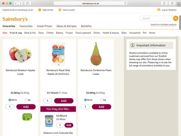
This dark pattern usually appears on online shopping sites, and refers to the difficulty of being able to compare the prices of products with each other, making it hard to base our purchase choices on informed decisions. A good example is that of Sainsbury’s supermarket in the UK, where the same product (in this case apples) is offered with prices once per unit and once per weight, making it impossible to compare them and find out which option is cheaper:
Bait and Switch
This pattern consists of offering users to perform a specific action, which instead leads to performing a different and unwanted action. A well-known example is that of Microsoft’s Windows 10 update, presented as a normal option at first, but then getting increasingly recurrent, practically forcing users to apply the update. As seen in the image below, the two ‘options’ (one highlighted and one in the form of a button) are the same, one saying “Upgrade now” and the other “OK”. In case of choosing not to update the system, users should click on the ‘X’ button in the upper right corner, but at one point they went as far as making the X button also mean that you want to update your Windows:

Something similar happens with YouTube and its pop-up option to subscribe to a premium account. Basically, they offer you to either subscribe after a 1 month trial, or to subscribe immediately:

As for Paraguay, a local case is that of the newspaper ABC Color:

Confirmshaming
This dark pattern seeks to make the user feel ashamed by making a certain choice, usually to cancel or decline a subscription or service.
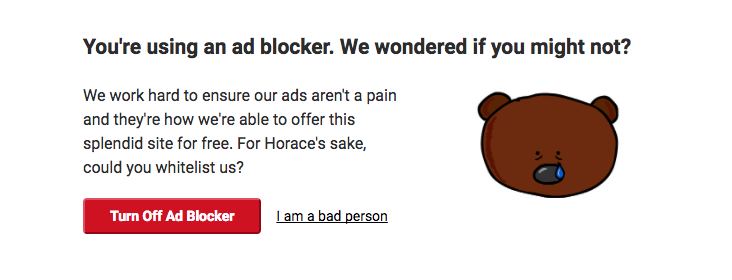
There is actually a Tumblr page dedicated exclusively to showing examples of this pattern. See below a good example of confirmshaming taken from this Tumblr page, where a site detects that the user has an ad blocker, and to keep using it he must click on the option “I am a bad person”:
Another example, where a store offers a discount coupon for creating an account and in order to decline you must click on the option “No thanks, I prefer to pay full price”:

In these matters, it is also important to highlight that the action “desired” by the platform is usually a button, while the option to decline the offer is a regular link, often using colors and fonts that make it less prominent.
Many times, this dark pattern is associated with another one called Forced Continuity, where users register for a free trial submitting their credit card details, and then after the trial period has expired they start being charged without any kind of warning. Oftentimes, this gets combined with the Roach Motel pattern, since the process required to cancel the service is in many cases absurdly tricky.
Disguised Ads
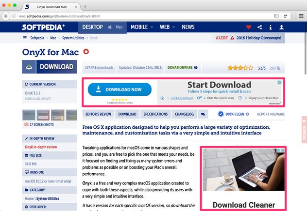
This dark pattern consists of ads that are disguised as other types of content so that users click on them. The typical case is the ad that appears to be a download button. See below an example from Softpedia:
Misdiretion
This dark pattern intentionally focuses our attention on an element or action that seems mandatory, but is often optional and can be skipped. A common example is that of airline companies when booking a flight online, in the section where they ask you to choose your seat, which often comes at a cost. This option is usually an opt-in extra that is not mandatory, but they place it in such a way on their platforms that it appears to be a mandatory choice, putting the focus on the option to accept the extra costs, and leaving out of focus the option to reject them. Here is an example from edreams.com that uses such a pattern:
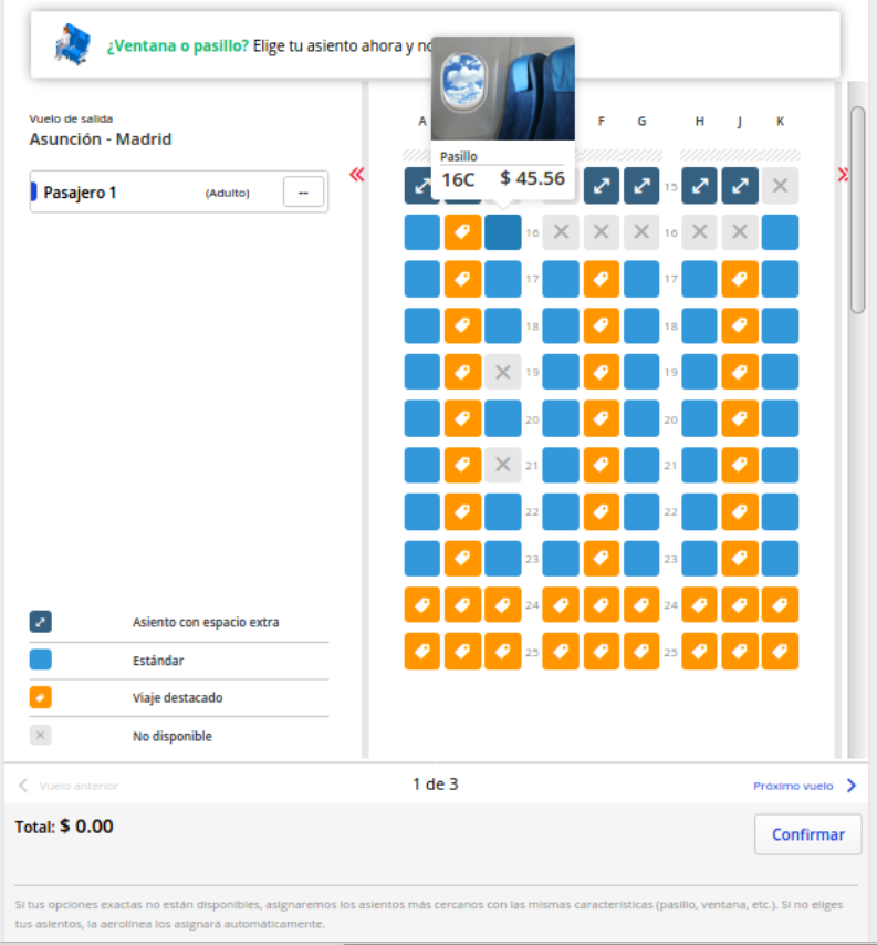
In this page, you could click on “Next flight” in order to opt-out, but that is not clear at all. Notice that this option is presented in plain text and in a size much smaller than that of the option “Confirm”, which is instead a large button. In the text at the bottom, in tiny font size and light gray color, it is finally mentioned that “if you do not choose your seats, the airline will assign them automatically”, without even mentioning the fact that this last option has no cost.
Hidden costs
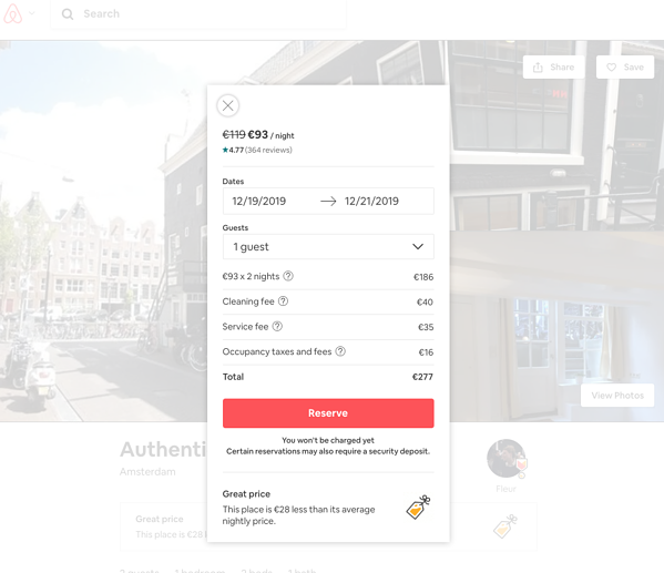
This pattern consists of adding unannounced and unwanted extra costs during the process of purchasing a product or service. In the AirBnb reservation example below, we see that the cost for 2 nights would be €186 but, by the time we finish the process, a cleaning cost of €40 euros, a service cost of €35 and an extra €16 for taxes and fees have been added. In the end, the total cost is €277, that is, €91 more than what we intended to pay:
Friend Spam
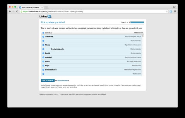
This pattern consists of manipulating users into giving their permission for the platform to spam their email contacts (posing as the users themselves), usually asking them to join the platform. The most well-known example is that of LinkedIn, which resulted in them being fined 13 million dollars in 2015, after losing a class action lawsuit in California. As a result, people who were victims of this dark pattern between September 2011 and October 2014 were able to submit a claim to receive a payout of about $10 each:
What can we do?
It is important that we recognize the different existing patterns, but it is more important to understand that if no one points them out or demands responsibility from the companies that implement them, these patterns will continue to be used in one way or another in different spaces. Collective organization to identify the different types of dark patterns, to point out the responsible companies, to generate awareness about it, and to demand more ethical and responsible design practices, is extremely important.
We invite you to visit and follow @darkpatterns on twitter to stay up to date with the patterns that users find, and incidentally, share the ones you find, pointing out the companies that continue to implement them. For more information, you can access the site darkpatterns.org, which keeps an up-to-date reading list on the subject.
We also recommend that you watch this short video to learn more about dark patterns:
Finally, if you identify any dark pattern online, please feel free to write to us at our contact form, or to share it with us through our different networks:
Twitter: @tedicpy
Instagram: @tedicpy
Facebook: @tedicpy1
Notas:
- More about heuristics: https://www.psychologytoday.com/us/basics/heuristics
- Brignull’s site on Dark Patters: https://darkpatterns.org/
- Types of dark patters on Harry Brignull’s website: https://www.deceptive.design/types


 ABC of our community in 2023